


In the world of doom, there is nothing more iconic than the Dopesmoker album cover. Sleep recorded what we know as “Dopesmoker” (as a single hour-plus piece) in 1996; label turmoil shelved it until unauthorized “Jerusalem” versions appeared in 1999 with varying covers. The “canonical” Dopesmoker finally arrived in 2003 on Tee Pee Records with the desert-pilgrim painting as the definitive artwork. Later, Southern Lord’s 2012 remaster used new/expanded artwork, created after direct conversations with Al Cisneros to better realize the album’s inner cosmology.
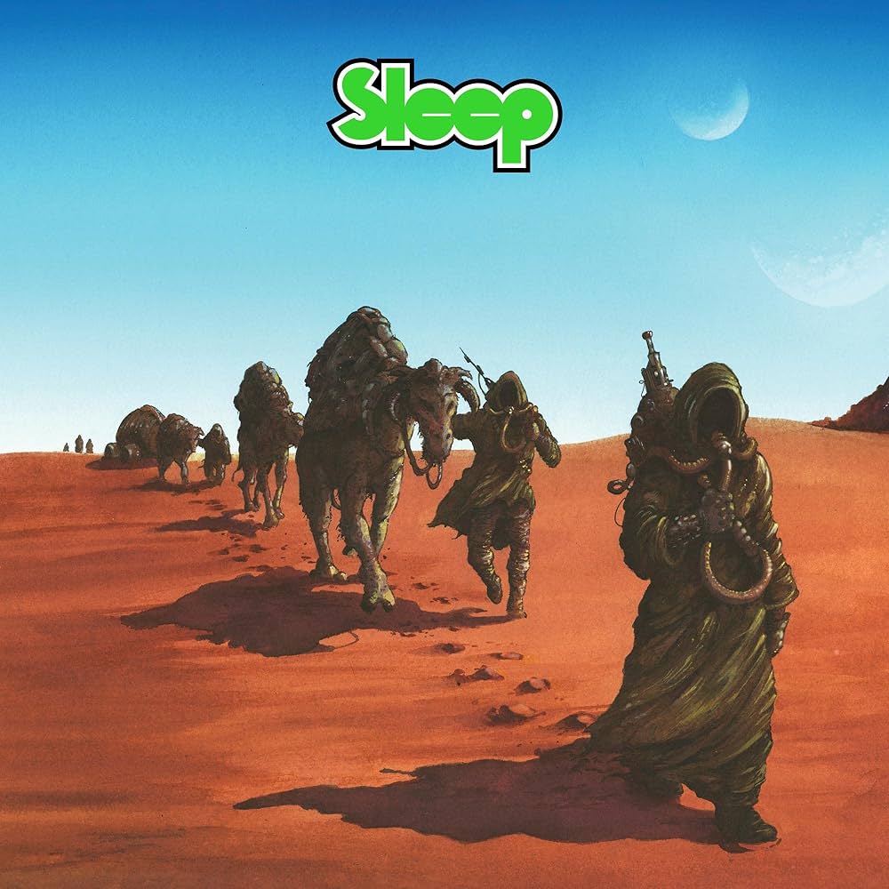
The famous painting shows robed figures trudging across an endless alien desert under a huge, heat-bleached sky—the Weedians, lifted straight from the song’s myth-making: “Proceeds the Weedian… follow the smoke to the riff-filled land.” The figures’ gear shows bong-like apparatuses and tubing—part survival kit, part sacramental technology—turning the trek into a stoner-doom pilgrimage.
Visually, it’s the album’s central metaphor made flesh: a religio-mythic rite of crossing—a congregation of Weedians advancing toward a promised, riff-sustained land. It reframes cannabis ritual, drone, and repetition as pilgrimage; the desert becomes the temple where endurance equals enlightenment. Critics have long read the cover as a slyly literal illustration of the concept—a caravan “with endless bongs strapped… like hydration packs,” trudging toward salvation by sound.
About the Artist
Arik Roper, the New York–based illustrator behind many of modern heavy music’s most recognizable images (Sleep, High on Fire, Earthless, Howlin’ Rain). He’s known for luminous watercolor/gouache and ink paintings with a strong 70s sci-fi/fantasy paperback vibe.
Roper’s process for this period is considered traditional painting (watercolor/gouache + ink) on paper/board, then prepared for print. He’s repeatedly cited 70s sci-fi/fantasy illustration (think Moebius, Chris Foss, Roger Dean) as touchstones—hence the parched color palette, curved horizons, and weightless, poster-ready composition that make the scene feel both ancient and futuristic.
The pairing of single-song monolith and singular pilgrimage image is unusually pure: both are slow, vast, and devotional. Roper distilled Sleep’s cosmology into one frame; fans can “read” the entire record in the posture, kit, and horizon line of those travelers. The result is one of heavy music’s most instantly legible icons—as essential to the lore as the opening line itself.
Side-by-Side Visual Analysis
2003 Tee Pee Records version (first official issue)
- Medium: Acrylic/gouache painting, scanned and formatted for LP/CD by Arik Roper.
- Palette: Muted earth tones (ochres, browns, dusty blues).
- Figures: Three Weedians in robes, walking left to right across a flat desert.
- Horizon: Low and flat, cutting the canvas almost evenly.
- Mood: Sparse, severe, apocalyptic. Reads like a still frame from an ancient prophecy.
- Concept: Symbolizes the first pilgrimage—a small, devout band of desert wanderers.
2012 Southern Lord remaster
- Medium: Roper created a completely new painting (not a recolor), more expansive and cinematic.
- Palette: Much brighter and more cosmic—deep blue skies, glowing sands, with more saturation.
- Figures: The Weedians are now a caravan, stretching back into the distance. They carry staffs, gear, and relics (often interpreted as bong-like vessels).
- Horizon: More dynamic—rolling dunes, layered perspective.
- Mood: Epic, infinite, transcendental. Suggests a whole civilization bound to the march.
Sleep Logo
The Sleep logo was hand-designed by Roper to embody the same heavy and timeless quality as the Dopesmoker art itself. It’s not just a font—it’s an iconic emblem of the Weedian world.
The modern Sleep logo debuted prominently on the 2003 Tee Pee Records release of Dopesmoker, alongside Roper’s desert-Weedian artwork. Roper wanted a logo that visually matched Sleep’s slow, heavy, otherworldly sound. The lettering draws from 1970s stoner, head-shop, and prog-rock aesthetics—rounded forms inspired by Roger Dean (Yes, Uriah Heep) and underground comix/psychedelic posters from artists like Rick Griffin and Stanley Mouse. The logo was hand-drawn by Roper, later digitized and refined for printing and merch use. The logo encapsulates Sleep’s identity—simplicity and mass. It has remained unchanged since its debut, used on Dopesmoker, reissues, The Sciences, Leagues Beneath, and nearly all official posters/merchandise.