


Black Sabbath
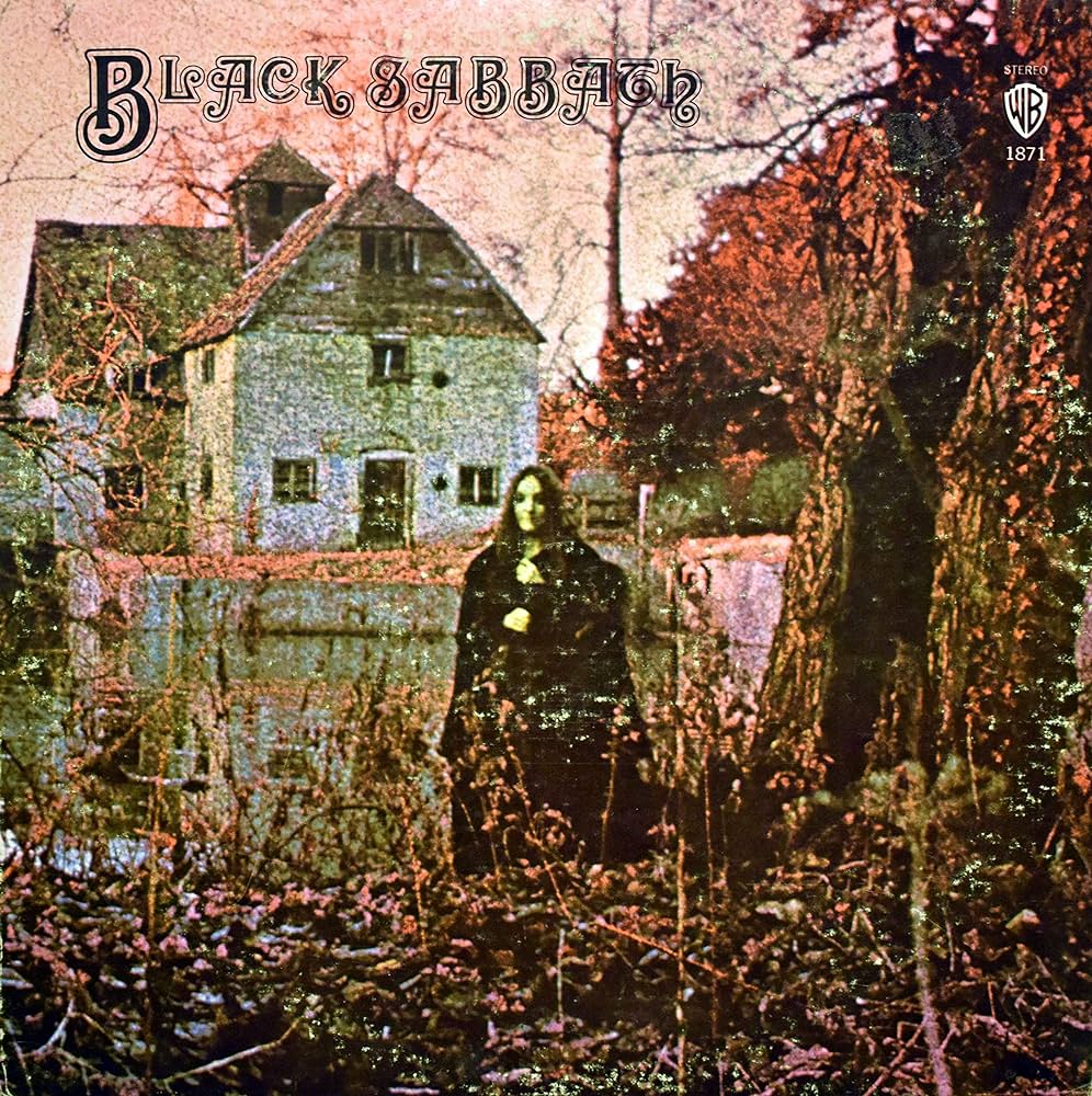
The album cover for Black Sabbath’s self-titled debut album, released on February 13, 1970, is one of the most iconic and mysterious in heavy metal history.
Who Created the Cover Art?
The haunting photograph was conceived and shot by Keith Macmillan, a British photographer also known as Keef. He worked closely with the band’s label Vertigo Records to create a visual that matched the dark, eerie tone of the music—something totally different from the psychedelic or colorful artwork popular at the time.
About the Art
The eerie scene was shot at Mapledurham Watermill, located on the River Thames in Oxfordshire, England. The location was selected for its historic and almost gothic appearance, perfectly setting the mood for the doom-laden sounds of Black Sabbath.
The woman in black is Louisa Livingstone, a model hired specifically for the shoot. Her ghostly presence in a long black cloak was intended to evoke feelings of unease and mystery, and over time, she’s become a kind of spectral symbol of the band’s dark aesthetic.
The goal was to reflect the dark, occult, and supernatural themes of the album. At the time, the music world hadn’t seen anything quite like Black Sabbath, and the album cover helped set them apart immediately. The foggy atmosphere, the somber palette, and the mysterious figure all worked to create a sense of dread and otherworldliness, tapping into occult and gothic imagery.
The band’s name, “Black Sabbath”, was itself inspired by horror films and literature. The cover, therefore, acted like the poster for a horror movie—and the band was the soundtrack.
- The building is real (the Mapledurham Mill), but the entire scene was staged to look ghostly and surreal.
- The color tone was manipulated post-shoot to enhance the sepia/greenish glow and make it feel otherworldly.
- Some fans believe there are hidden images or subliminal faces in the foliage and background, adding to the mythos (though these are likely happy accidents or pareidolia).
- The cover has been cited as one of the first truly “metal” album covers, setting the stage for decades of heavy music aesthetics.
Black Sabbath’s debut cover is regularly ranked among the greatest and most haunting album covers of all time. It created a visual language for metal—mystery, horror, and heaviness—that’s still in use today. Combined with the chilling toll of the opening track’s bell and the thunderous riff that follows, the art serves as the perfect visual introduction to the birth of heavy metal.
Paranoid
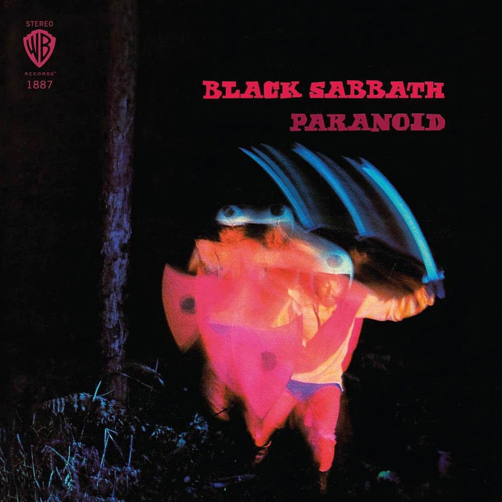
While Paranoid, released on September 18, 1970, became one of the most influential albums in heavy metal history, its cover art has long been a subject of confusion, curiosity, and even some embarrassment from the band themselves.
Who Created the Cover Art?
The artwork was again shot by Keith Macmillan (aka Keef), the same photographer responsible for the iconic debut album cover. However, unlike the eerie and evocative art of the first album, the Paranoid cover took a more spontaneous—and strange—turn.
About the Art
Many of you may already know, the original album title wasn’t Paranoid—it was going to be War Pigs.
The band had written a scathing anti-war song of the same name, and that was intended to be both the lead single and the album’s title. Keith Macmillan was given this theme to work with and set up a photo shoot inspired by it.
What you’re looking at is a blurred photo of a man in a cape, helmet, and holding a sword and shield—intended to be a stylized, surreal “war pig.” The person in the photo is not a band member; it’s a model posing for the theme of the original title. The colors and motion blur were created with long-exposure techniques and dramatic lighting to give it an otherworldly, trippy look.
Here’s where things got a little odd. Just before release, the label decided to change the title from War Pigs to Paranoid, believing Paranoid was more marketable and less controversial, especially during the height of the Vietnam War. Problem is: the cover art had already been done. So, what you end up with is a mysterious neon warrior running through the woods—something that has absolutely nothing to do with the word “paranoid.”
The result? A completely disconnected image that left fans scratching their heads—and the band hating it. Ozzy Osbourne has famously said that the Paranoid cover looks “ridiculous,” and the band wasn’t thrilled with how their dark, serious music was being represented by such a goofy, psychedelic image. They felt it undermined the tone of their increasingly heavy and socially conscious music.
Because the artwork doesn’t match the album’s themes, most of the interpretations are retroactive. Some fans try to link the figure to mental instability or paranoia, with the blurred figure representing a distorted mind—but that was never the intention.
Still, over time, the strangeness of the cover has added to its mystique. It’s become iconic by accident—not because of how well it fits the music, but because of how oddly it doesn’t. In a way, the weird disconnect of the artwork adds to the album’s legend. It’s part of the strange charm of early Sabbath—rough around the edges, a little chaotic, but undeniably powerful.
Master of Reality
Released on July 21, 1971, this record took Sabbath’s already heavy sound and turned it into a monolith. But unlike the trippy weirdness of Paranoid, the cover art for Master of Reality is bold in its simplicity and packed with understated power.
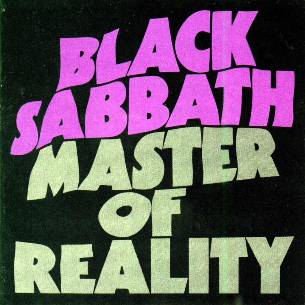
Who Created the Cover Art?
The original Master of Reality cover was designed by Mike Stanford at the design studio Bloomsbury Group, with typography by Typographic House. While no elaborate photo shoot was involved this time, what makes the cover stand out is its minimalist, yet heavy design approach.
About the Art
- A deep black background—matte and velvety in feel (on the original vinyl).
- The band’s name, “Black Sabbath,” printed in bold purple across the top.
- The album title, “Master of Reality,” appears in a thick, heavy gray font beneath—embossed and slightly raised, creating a 3D effect you could feel with your hands.
This was a tactile experience, not just a visual one. The cover itself mirrored the music: heavy, monolithic, and deliberately stripped-down. Unlike the surrealism of Paranoid or the gothic storytelling of the debut, Master of Reality was a flex: an album that didn’t need imagery to sell itself. The music was the message.
The minimalism became the aesthetic. In a sea of psychedelic, fantastical, or grotesque album covers of the early ’70s, this one stood out by doing less—but in a much heavier way.
The typeface used for the album title (especially in the original purple/gray edition) became iconic in the world of doom and stoner rock. It’s been widely imitated in everything from band logos to posters, merchandise, and even beer labels. When you see that chunky, distorted lettering, you can practically hear the down-tuned guitars.
Some early UK and US pressings had slight differences. Purple lettering in some versions, grey or black-on-black in others, and some reissues lack the raised lettering or embossed texture altogether.
The band was reportedly happy with the shift. After their dissatisfaction with Paranoid’s misaligned cover art, the more serious and mysterious Master of Reality look was more in line with their growing identity as pioneers of a new, darker musical movement.
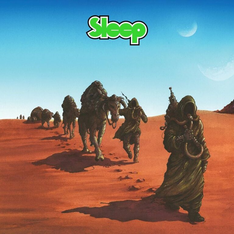
Master of Reality has become a cornerstone of doom, sludge, and stoner rock—its influence is seismic. And its cover? A visual precursor to decades of heavy music aesthetics. You can see echoes of this art in bands like Sleep, Electric Wizard, Monolord, Windhand, and countless others. All of them owe a bit of that “black-purple-heavy” aura to Master of Reality.
Vol. 4
Black Sabbath’s Vol. 4—a record where the band leaned into their fame, fortune, and full-throttle hedonism, while still cranking out some of their most iconic and diverse songs. Released on September 25, 1972, Vol. 4 was Sabbath’s fourth studio album, and its cover art is instantly recognizable—bold, strange, and steeped in mystery.
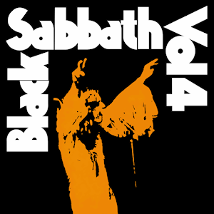
Who Created the Cover Art?
The artwork for Vol. 4 was again created by Keith “Keef” MacMillan, who was already known for crafting striking album covers in the ‘70s. The image was pulled from a live photo of Ozzy Osbourne, taken at a Black Sabbath concert at the Hollywood Bowl in 1972, by photographer Fin Costello.
MacMillan transformed the live photo into a high-contrast, black-and-orange silhouette, stylizing Ozzy into a sort of saintly psychedelic figure—hands raised, cape billowing, frozen in mid-blessing… or mid-trip.
About the Art
The image is simple but loud:
- A blocky, bold-fonted “BLACK SABBATH VOL. 4” lined up around the edges.
- A vivid, pumpkin-orange silhouette of Ozzy on the left, arms raised in messianic fashion.
- A black background that makes the two elements explode visually.
It’s both minimalist and maximalist, depending on how you look at it—like something between a protest poster and a rock ‘n roll gospel flyer.
The cover doesn’t have a literal narrative, but it radiates vibe and mythology. It captures Ozzy in what looks like a religious ecstasy, symbolizing the way Sabbath had begun to be worshipped by a growing, almost cult-like fanbase. There’s a certain messianic aura to the image—very fitting for a band that was reshaping the spiritual landscape of rock.
But here’s the twist: Vol. 4 is also the album where the band began to spiral personally. So while Ozzy’s pose might suggest holy transcendence, the reality was far grittier—cocaine binges, burnout, and excess surrounded the making of this album. It’s worship and collapse all rolled into one picture.
The band originally wanted to name the album Snowblind—a direct nod to their, uh, affection for cocaine (the word “snowblind” is even whispered several times during the song of the same name). But the label said no.
Still, the drug references made it in—and not subtly. Vol. 4 was self-produced by the band (with some help from Patrick Meehan), and they reportedly blew through piles of coke during the sessions at Record Plant Studios in Los Angeles. The legend goes that the record sleeve should’ve come with a mini vacuum and a mirror.
The dual energy of this album—creative brilliance and personal destruction—is perfectly encapsulated in the cover’s almost saintly reverence of Ozzy. The contrast of loud and soft, chaos and clarity, is baked into both the album and its visual identity.
Original pressings of Vol. 4 came with a gatefold sleeve featuring more live shots, a fold-out poster (rare and now highly collectible), and later versions sometimes dropped the gatefold or altered the coloring slightly.
The orange Ozzy silhouette became an enduring visual—iconic in the world of stoner and doom culture, and often reproduced on merch, posters, and bootlegs.
The Vol. 4 cover stands as a snapshot of Sabbath on the brink—both musically ascending and personally unraveling. It’s psychedelic without being cliché, spiritual without being preachy, and iconic without trying too hard.
And it has inspired countless homages in heavy rock and doom aesthetics. Bands like Sleep, Kadavar, and Uncle Acid owe a bit of their visual DNA to this record.
Sabbath Bloody Sabbath
Crank the volume, dim the lights, and enter the twisted cathedral of doom that is Sabbath Bloody Sabbath—a record where Black Sabbath went baroque, bold, and brilliantly dark, both musically and visually. Released on December 1, 1973, this album wasn’t just a comeback from exhaustion and writer’s block—it was a transformation.
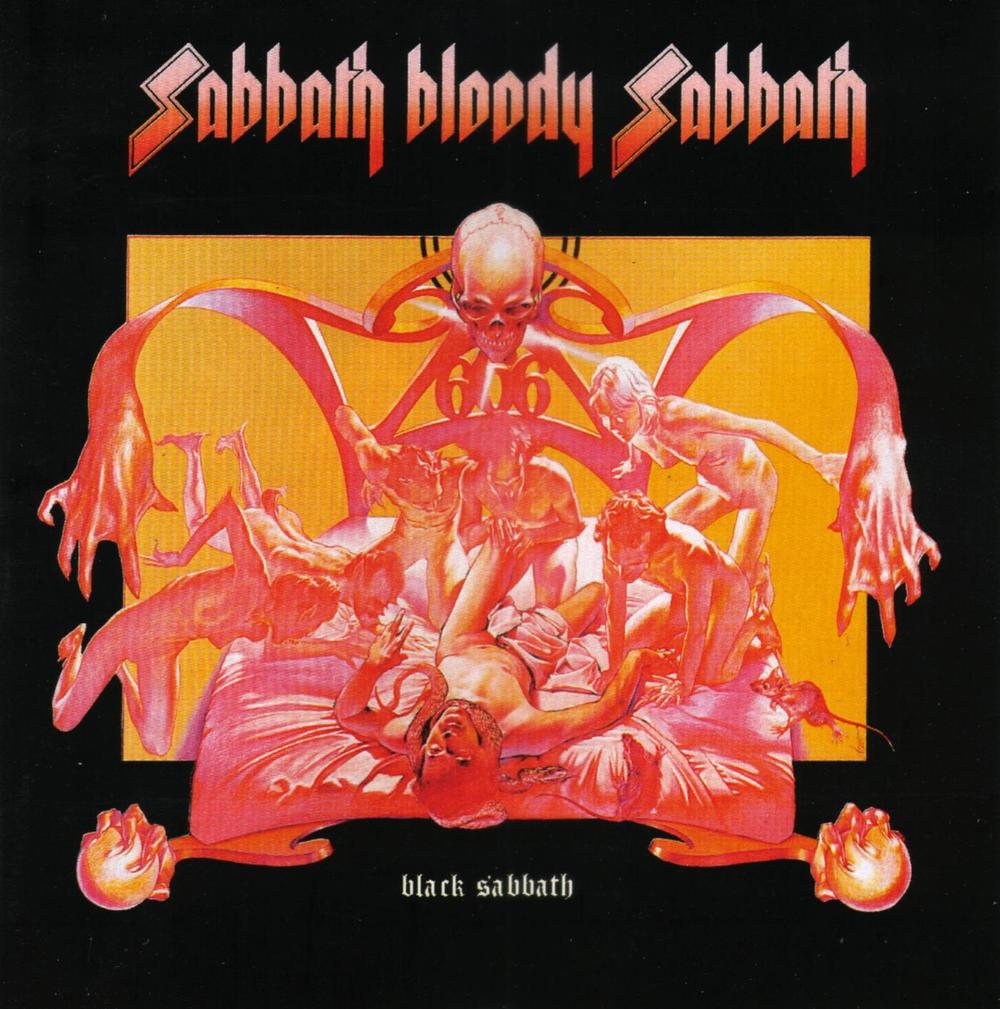
Who Created the Cover Art?
The artwork for Sabbath Bloody Sabbath was created by Drew Struzan, an illustrator who would later become famous for legendary movie posters—Star Wars, Indiana Jones, Back to the Future, and more. But before Hollywood came knocking, Struzan was working on album covers, and this one? An absolute fever dream of surrealism and symbolic horror.
Struzan worked for Pacific Eye & Ear, a design studio known for its wild, psychedelic album art. The concept for this particular cover was a team effort between Struzan and art director Ernie Cefalu, and it went on to become one of Sabbath’s most iconic and disturbing visuals.
About the Art
The front cover of Sabbath Bloody Sabbath depicts a man lying in bed, writhing in agony, surrounded by demonic, skeletal figures. Flames lick the bedposts, and the figures appear to be dragging the man’s soul out of his body. The scene screams possession, torment, and death.
Now flip to the back cover—same bed, same man… but this time, he’s peacefully asleep, surrounded by angelic beings. It’s the mirror opposite of the front.
Together, the two images represent a spiritual tug-of-war—good vs. evil, salvation vs. damnation. Pretty much a visual thesis statement for what Sabbath was writing about: the struggle of the human soul, both internal and external.
The dual imagery reflects the themes of the album itself—mental anguish, existential crisis, addiction, control, death, and redemption. After the chaos of Vol. 4, the band found themselves burned out and creatively blocked, almost breaking up before regrouping at Clearwell Castle in England.
It was in that literal medieval castle, surrounded by eerie halls and ghost stories, that Tony Iommi came up with the title riff for “Sabbath Bloody Sabbath”—and the dam broke. The band was inspired again, and the album became one of their most ambitious yet.
The artwork mirrors that rebirth—a trip to hell and back, captured in shocking detail. The music is complex and theatrical, so the dramatic, hellish artwork serves as the perfect visual counterpart.
- Original LPs came with a gatefold sleeve, opening to reveal lyrics and more cryptic art.
- The inner artwork, also by Struzan, expands the surreal horror aesthetic.
- The combination of front and back covers created a lot of fan theories—some seeing it as a metaphor for addiction, others interpreting it as a literal depiction of heaven and hell.
Sabbath Bloody Sabbath’s cover art is arguably the most theatrical and storytelling-driven cover Sabbath ever released, paving the way for more conceptual album art in metal. And let’s be honest: if you walked into a record shop in 1973 and saw that thing on the wall, you bought it—if only to figure out what kind of music could possibly sound like that.
Sabotage
Sabotage—the sixth studio album from Black Sabbath, released on July 28, 1975. Musically, it’s one of Sabbath’s most raw, aggressive, and emotionally charged works. But visually? Let’s just say it’s earned a place in rock history for… very different reasons.
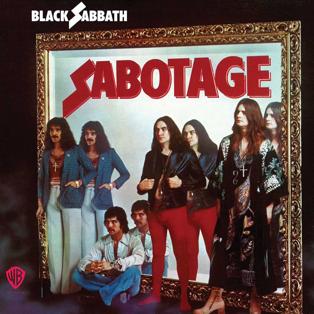
Who Created the Cover Art?
The artwork was photographed by Graham Hughes, who had previously worked with the band on the Sabbath Bloody Sabbath cover (yes, really). But instead of another sweeping epic of demons and duality, Hughes went in the complete opposite direction—a stark, awkward photo shoot featuring the band standing in front of a mirror.
About the Art
First, the fashion… Ozzy Osbourne is wearing a kimono-style shirt and some killer boots, while Bill Ward, famously, showed up late to the shoot and borrowed his wife’s red leggings, blouse, and platform shoes. No joke.
Originally, the band thought this was just a test photo—a rough mock-up. They were shocked when Warner Bros. used it as the final artwork. But by then, it was too late. Cue decades of confusion, laughter, and countless memes.
The mirror concept was supposedly meant to symbolize reflection, as the album itself was about the band being sabotaged—emotionally and legally—by their management. During this time, Sabbath was dealing with intense lawsuits and betrayals behind the scenes, so the album is laced with paranoia, frustration, and rage.
But the execution? Well, it didn’t exactly scream “revenge” or “betrayal.” It kind of whispered, “glam rock karaoke night.” That said, the mirror concept is a stroke of subtle brilliance. If you look closely, the album’s title appears on both sides—hinting at sabotage not just from external forces, but from within the band itself. It’s a clever thematic detail buried beneath the visual chaos. And the reflection? It’s not a true mirror image at all, but more like a psychedelic funhouse mirror—warped, surreal, and strangely fitting for an album born out of confusion and betrayal.
Despite the goofy artwork, the music on Sabotage is anything but funny. It’s fierce, technical, and seething with tension. Sabbath was pushed to the edge by legal battles, and you can hear it.
Early LP pressings featured the image in crisp high contrast, but later versions toned down the bright colors. The gatefold versions often included lyrics and credits, but nothing that helped explain the mystery of the cover. Over time, the artwork has gained cult status—fans love it because it’s so awkwardly honest and weird. It’s like a time capsule of glam-era confusion dropped into a doom metal timeline.
Sabotage remains one of Black Sabbath’s most underrated and musically brilliant albums. The juxtaposition of artistic fury and awkward fashion makes this album cover one of the most talked-about in rock history. The disconnect between the cover and the content just makes it all the more unforgettable.
There you have it! The quick history of the album artwork of the iconic first six Black Sabbath albums. What records should we dive into next?